web / macOS / desktop / iOS / android
Accelerated product experimentation by reducing design-to-development cycles from weeks to days.
Duration
Team
My Main Responsibilities
The product team for our digital workplace app has immense pressure to ship early, often and FAST to collect user feedback. Not having a design system resulted in lack of common language between designers and developers. Developers needed every screen designed by a designer before committing to writing code. There was lack of consistency in the design work as designers showcased their own style when creating UI elements. All of this was slowing down production.
Designers and UI engineers
We had two goals in mind when creating our design system:
To kick off this initiative, I did not start with designing components. The first step, and most important, with this design system supporting a brand new product, was to get team alignment (designers, developers & stakeholders) on the look and feel of the product. This was achieved through mood boards and applying those styles to designing comps for the product. Potential customers were also included in the process. As we were interviewing users to learn their needs, we would show them some screen designs to collect their reactions about the user interface. The sales team would also show designs to current customers of Infragistics' sister products to collect their feedback on this new product we were creating.
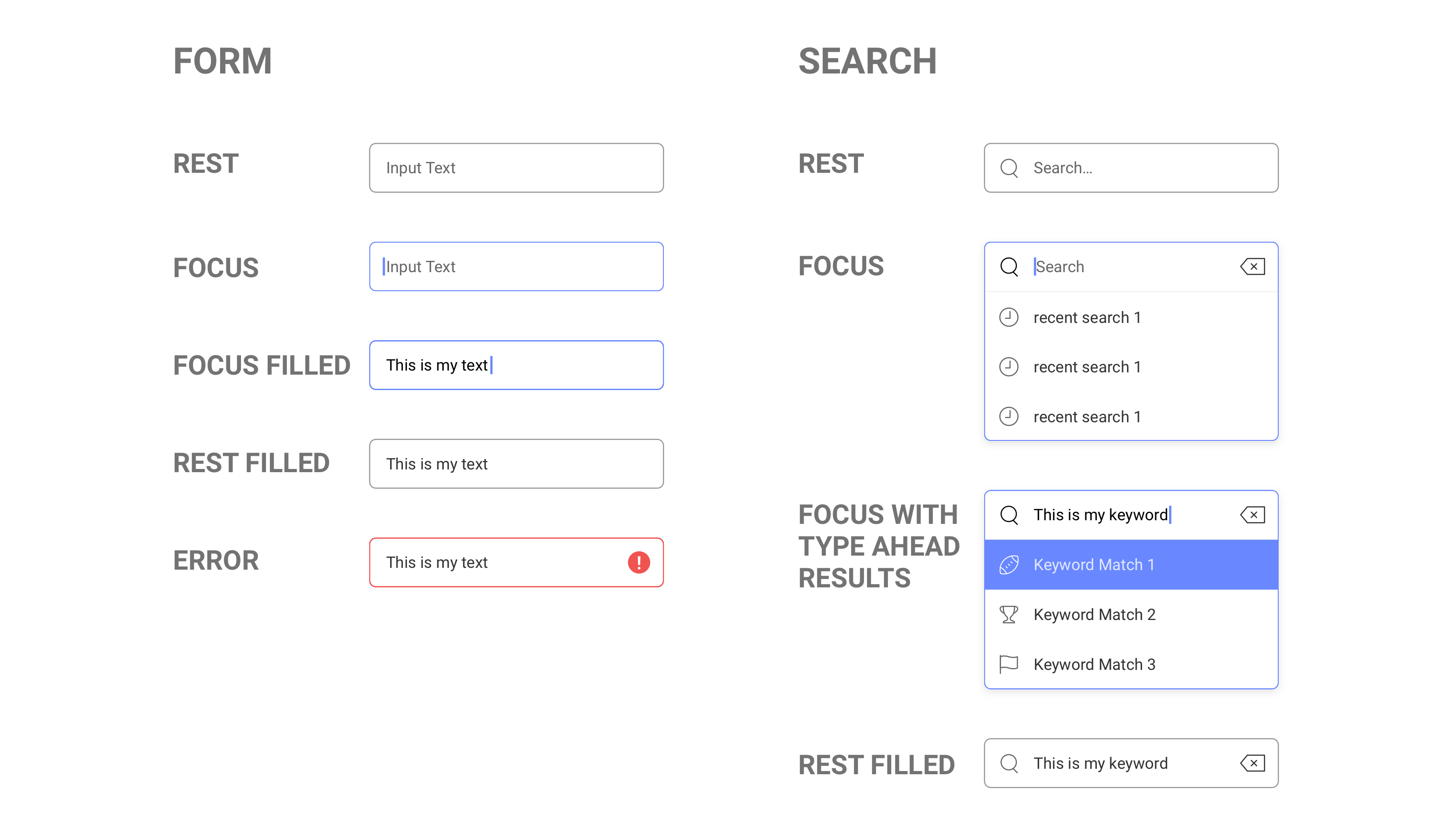
The styles of our components, such as spacing, font sizes, text color is a result of best-practice design shared by Material Design and iOS Human Interface Guidelines. I shared with my team of designers this documentation to make sure what we are creating will feel familiar to our customers. We also follow the atomic design process, where we start with the basic blocks needed for the component, then group them together to form patterns. Then we design screens with our components to create the pages of the app.
We tested the clarity and functionality of our components as we tested our feature designs with users. We learned that early concepts felt too 'monotone'. Our components for displaying task info was 'too busy and cluttered'. At Infragistics, as a company, we strive for simplicity & beauty in our designs. With each round of feedback, we were able to iterate fast on our designs and get them implemented into the next release of our beta, allowing us stick to that global design principal.
As a UX team, we agreed to hold our designs to these principals:
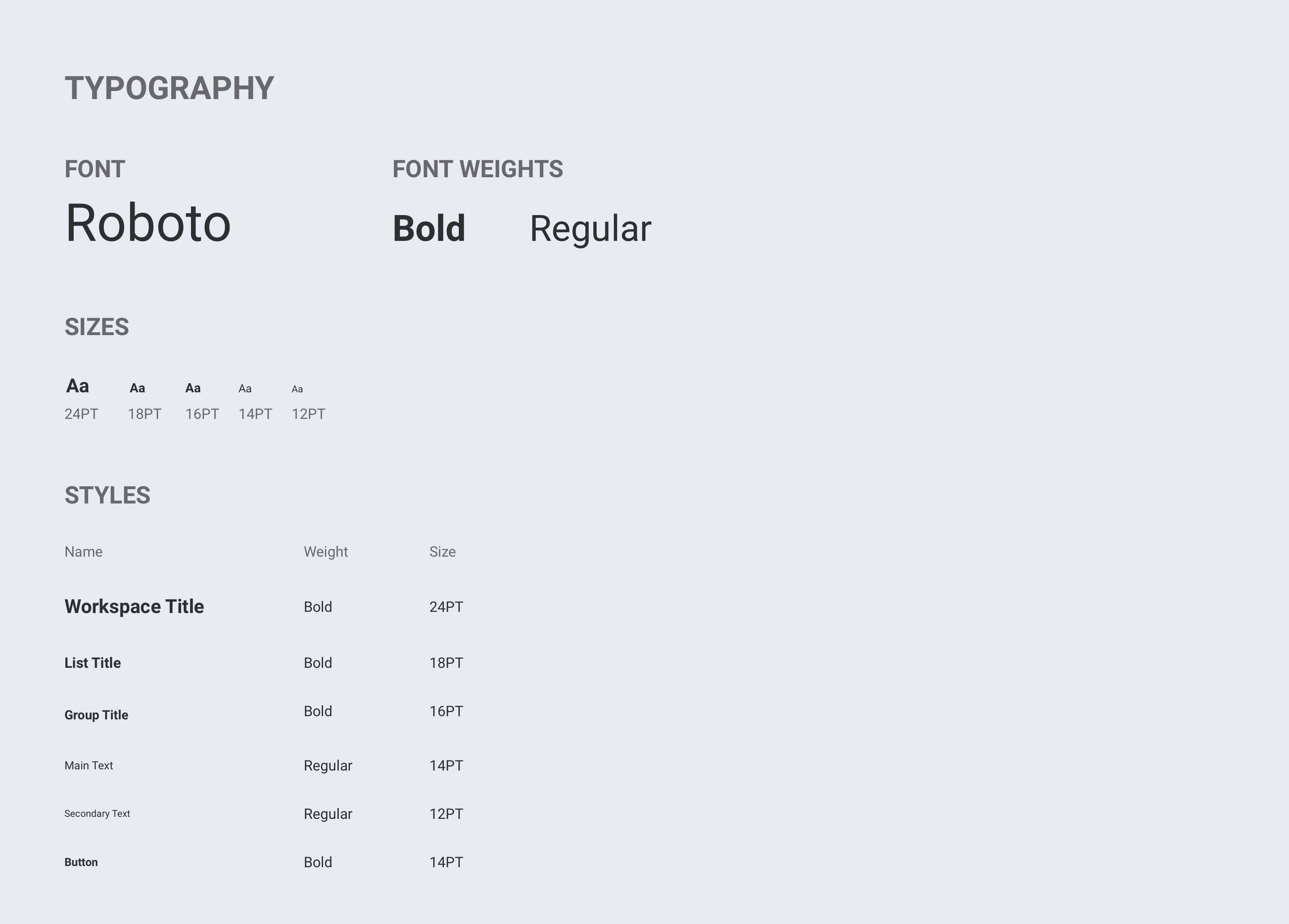
We chose Roboto because of its readability at various sizes and its font-weights.
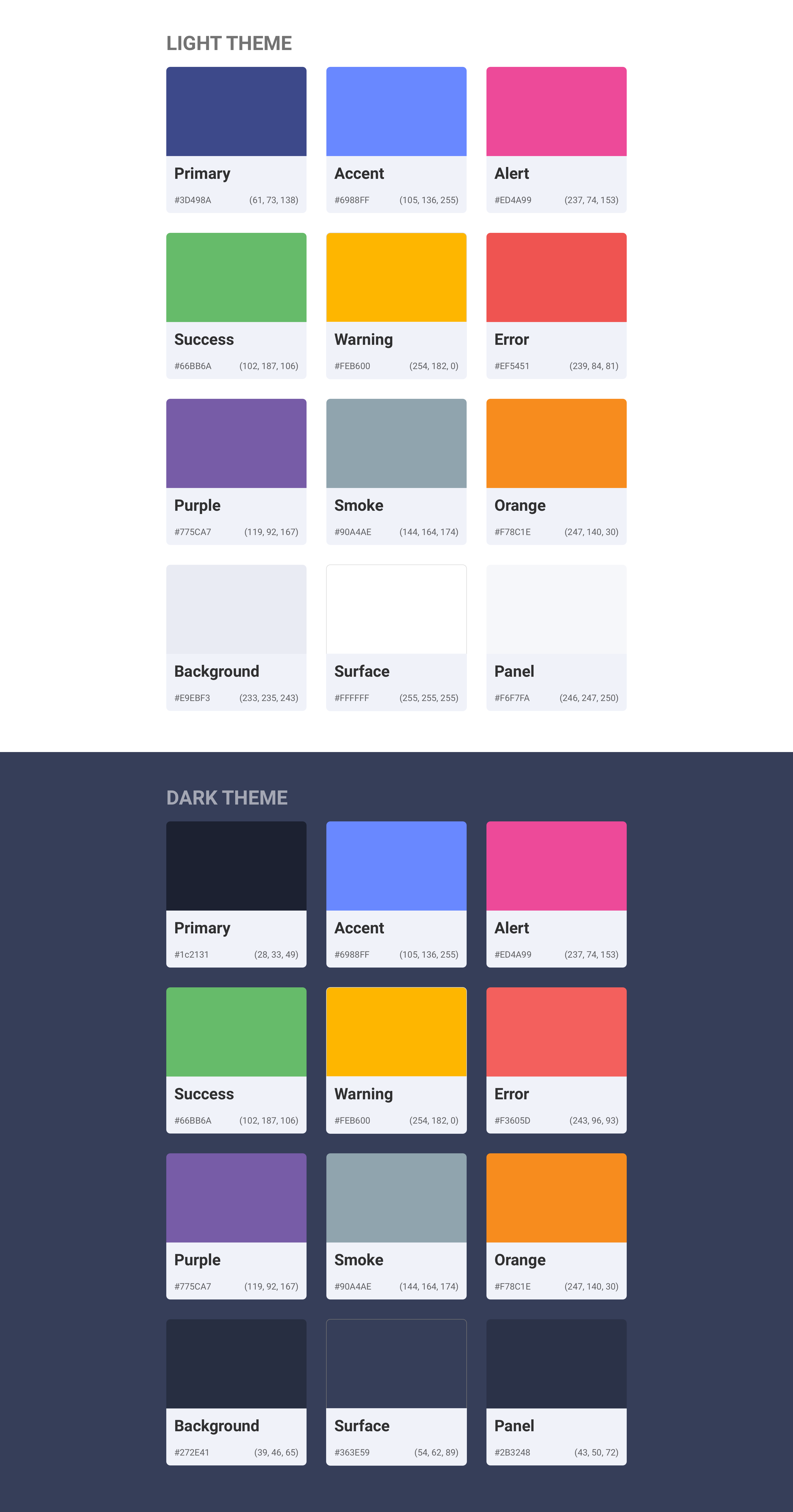
Color swatches were carefully selected and tested with users with our design goal of having a clean interface where the color represents the content, ie: task status, priority label, overdue tasks. We also needed to create a palette that works in both dark and light themes. This is important because in our data visualizations and in tasks, the color represents a status. The colors must have the same appearance & meaning in both themes to not confuse team members who are working in different themes.
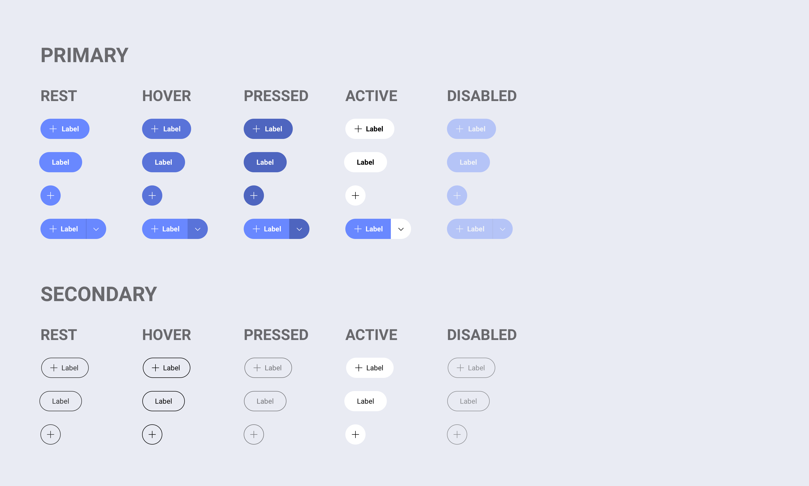
Before pages could be designed, we needed to create components for the shell of the application. It went through several iterations, landing on a solution that is scalable to support customer needs and the product vision.
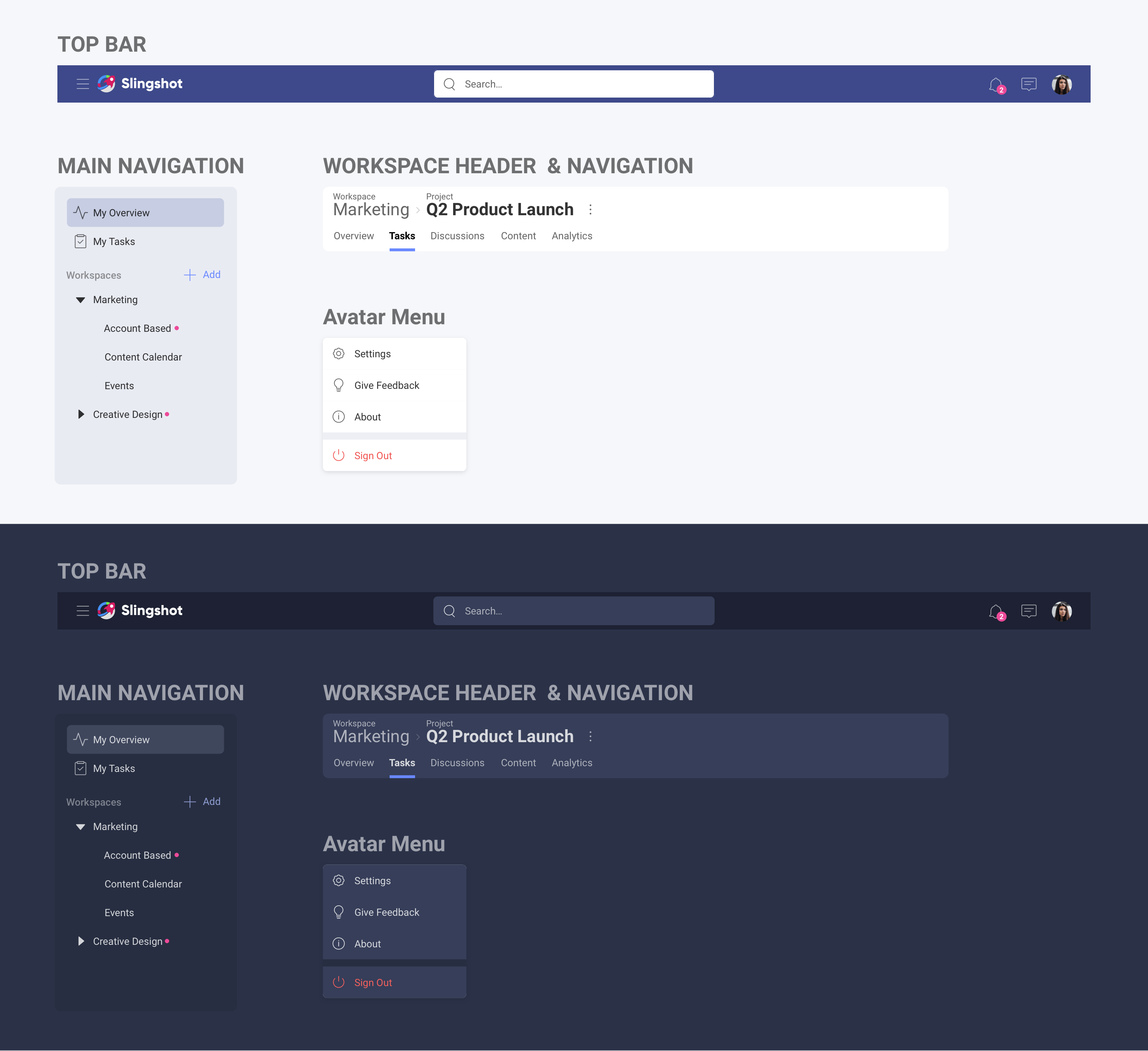
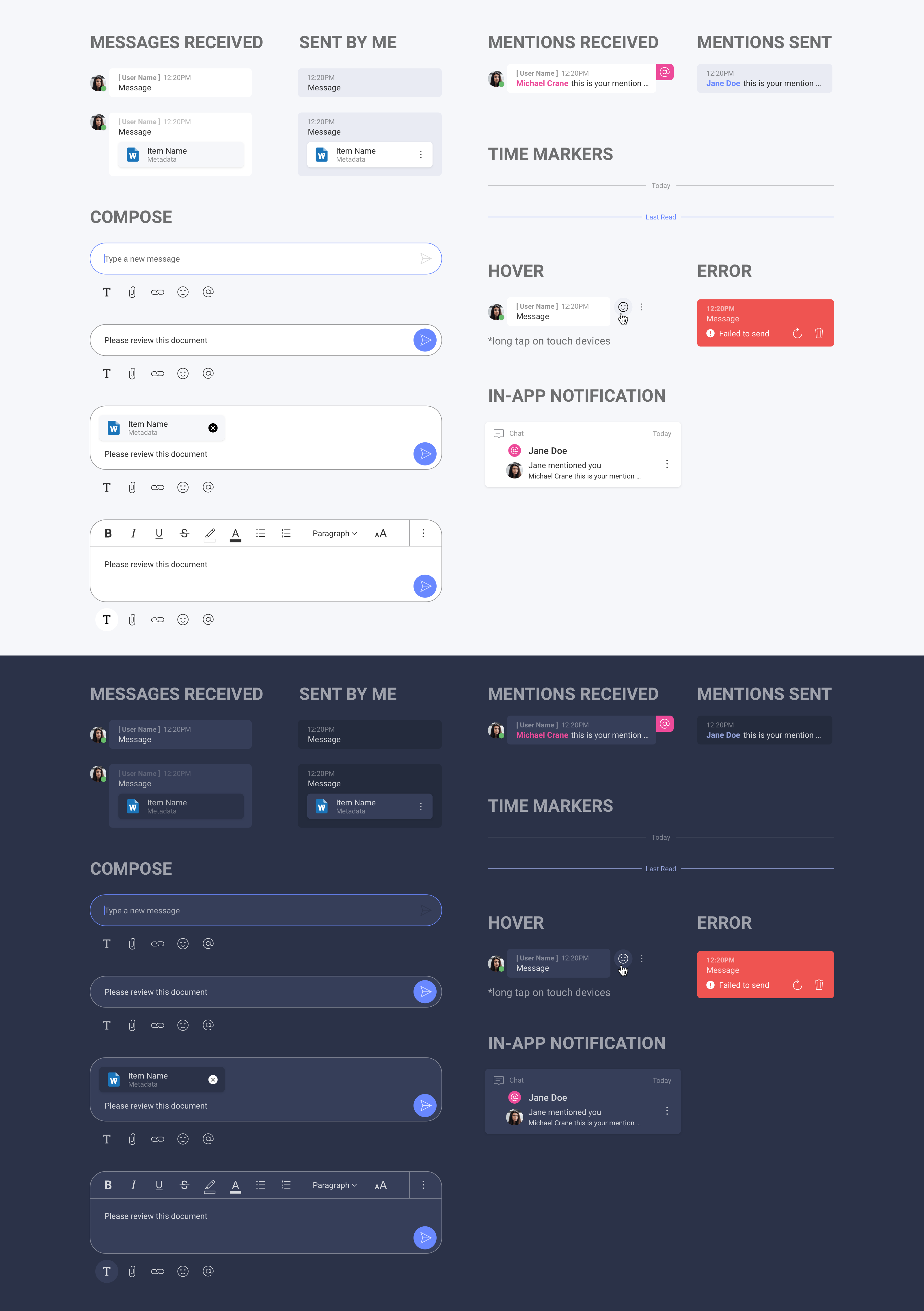
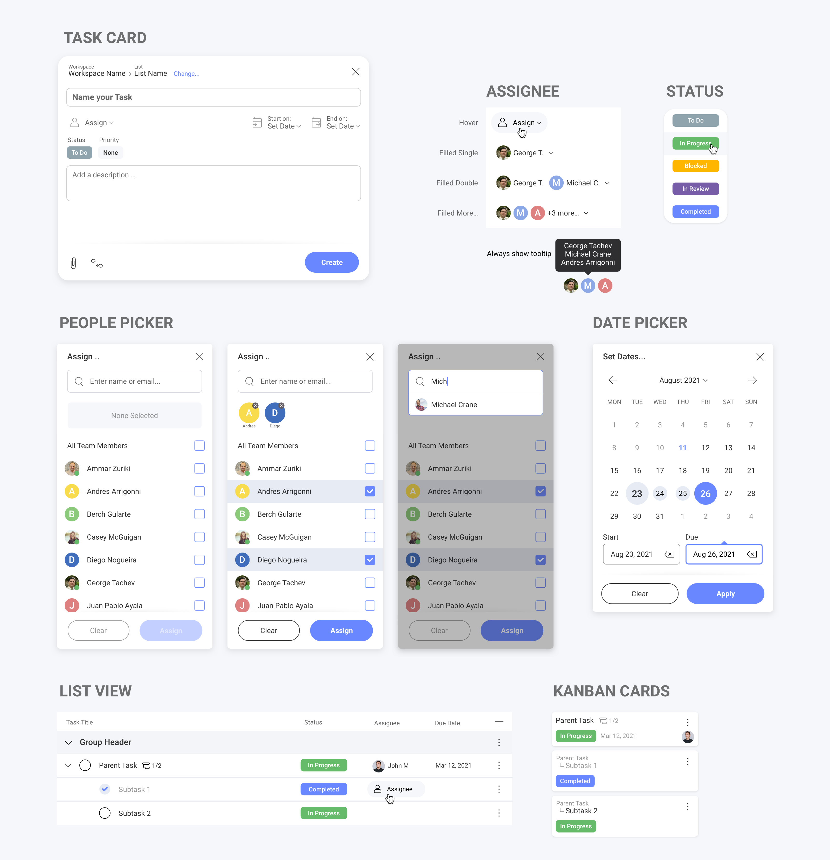
When designing pages, we place our components into a layout to build the structure of the design. Together, these components are the back-bone of our system. It is critical when making edits to a screen, that we check our edits across the system to make sure the change we are making does not break the experience of the component elsewhere in the app.
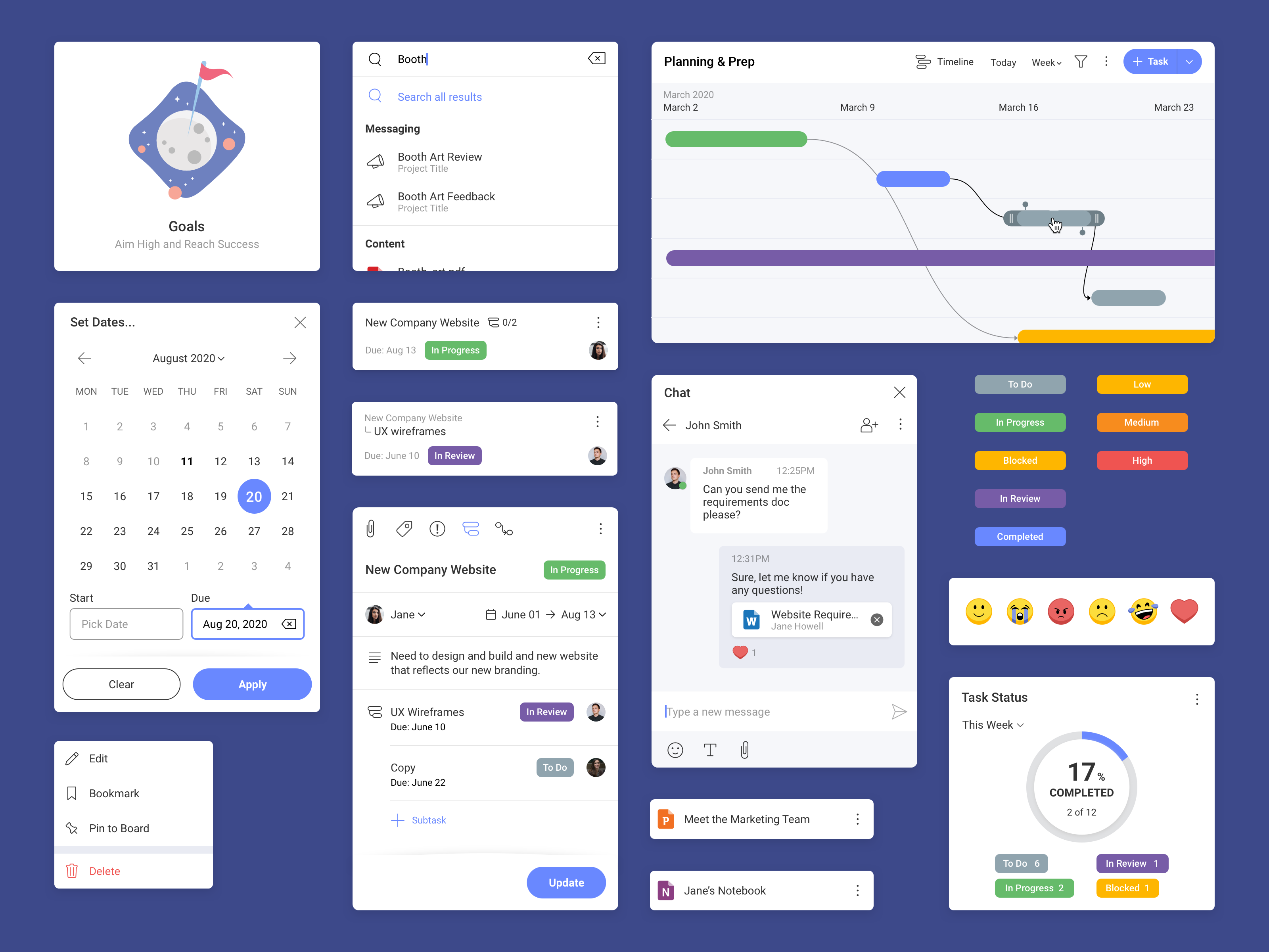
These components are combined to build our page for tasks
Since launching our design system, the design and engineering teams are now: