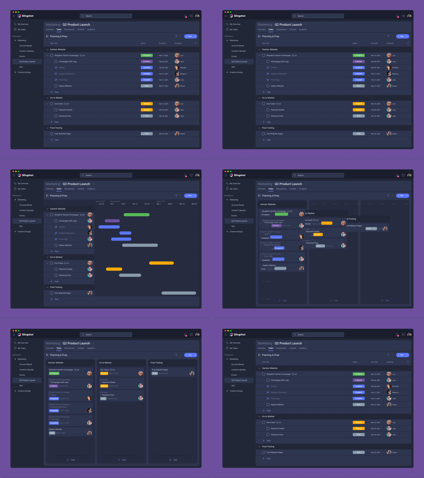
Digital Workplace for Web, MacOS, iOS, Android
Helping teams stay on track with their projects while speeding up their workflow.
Duration
Team
My Main Responsibilities
Teams have assets spread across multiple business applications. As a result:
This slows down productivity & causes teams to feel chaos in their work lives.
For first release we will target Managers and Individual Contributors who work on project driven teams.
Together with the Product Owner, I performed user interviews with managers, directors and individual contributors at 10 companies. The goal was to learn about how they work as a team, what is important to their processes, and what pain points do they have in their current process.
Pain Points:
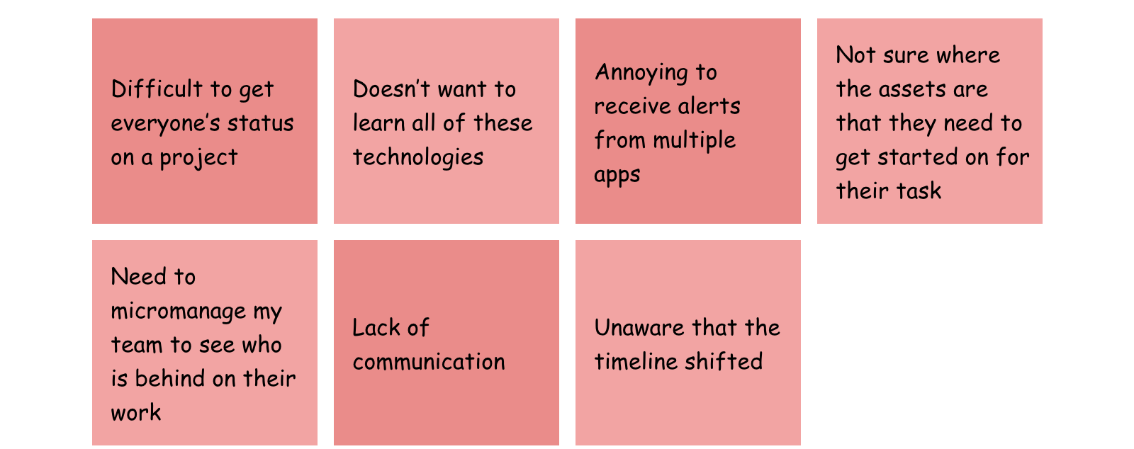
After the interviews were complete, I grouped the insights together into an affinity map, using Miro, to visualize the common patterns. At this time, I am starting to present to the product team. This is to start to get ideas brewing and have the engineering team start thinking about what we will need to build.
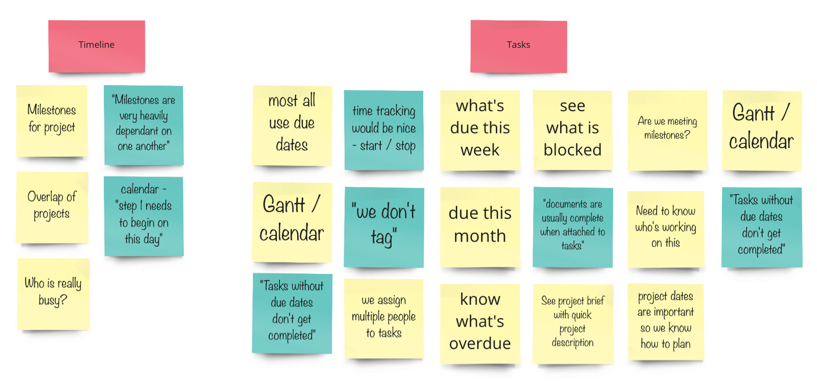
A portion of the feedback from user interviews shared with the product team
Deliver an easy to use system that:
Working closely with product leadership, I ran a workshop where we scoped our v1 release, driven by the insights I uncovered from the research.
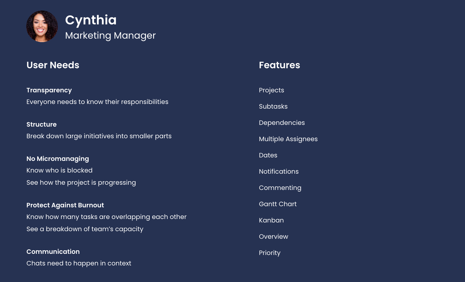
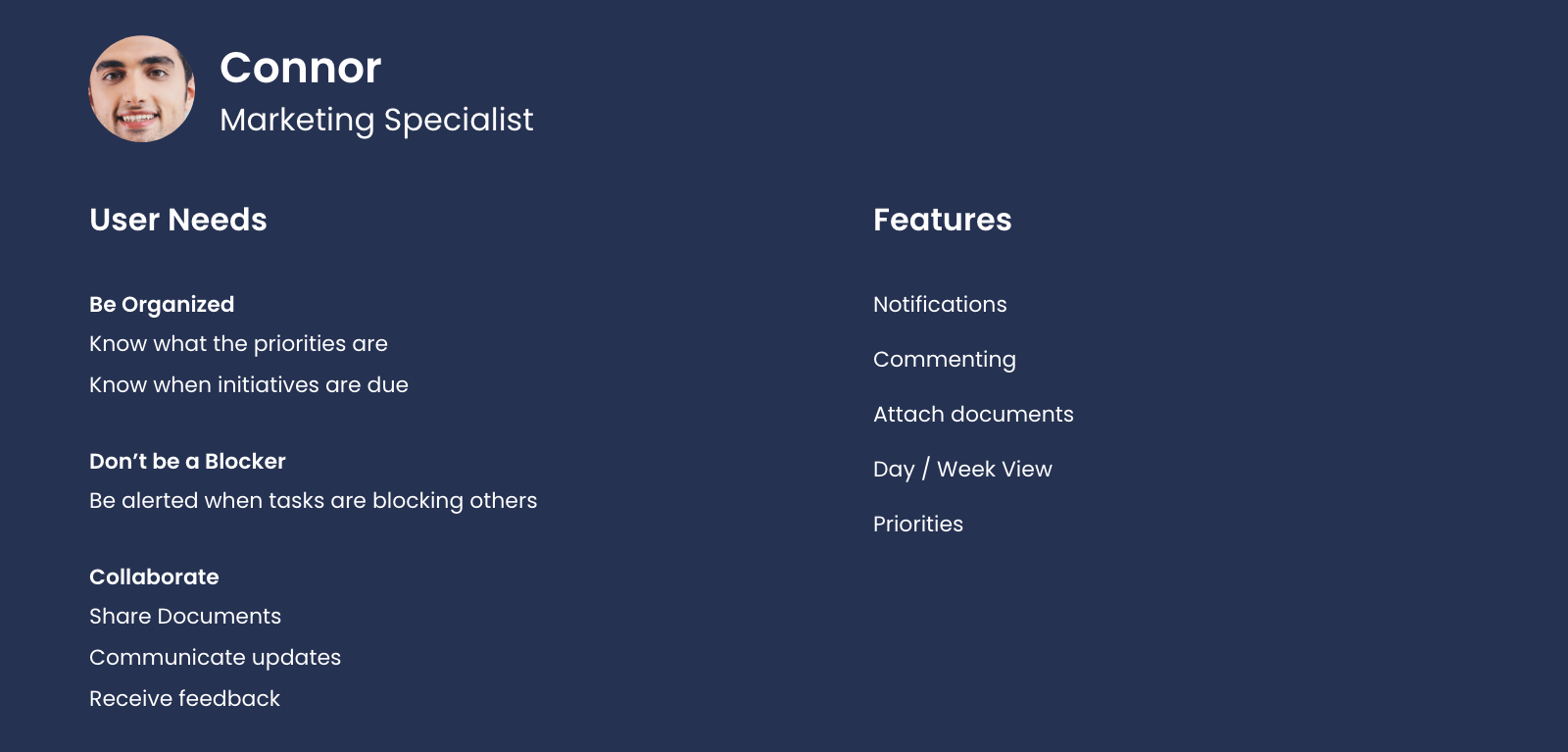
User stories crafted from insights discovered through user interviews
My design team is spread out throughout the world, located in Uruguay and Bulgaria. I ran remote ideation sessions using Invision Freehand for us to whiteboard ideas together, focused on the information architecture of the app, and how managing tasks can fit into that structure. Our approach was to not only design a viable solution for the v1 release that was agreed upon with product leadership, but also focused on the larger picture of the feature. This allowed features that were scoped as a v2 to fit in nicely into the product.
As we were exploring UX concepts for the feature, we took the following into consideration:
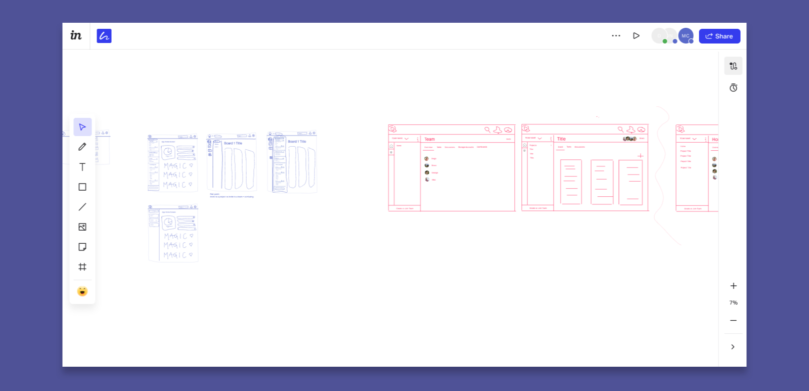
Whiteboarding in Invision Freehand ideating with remote design team
I worked lean so I could start testing prototypes to receive early feedback. Early tests focused on taking the design hypothesis we had for creating the task structure as well as re-ordering the tasks to validate if we were going in the right direction. One of my tactics to understand the mental model of users in regards to creating and managing tasks was I ran a workshop with paper prototypes.
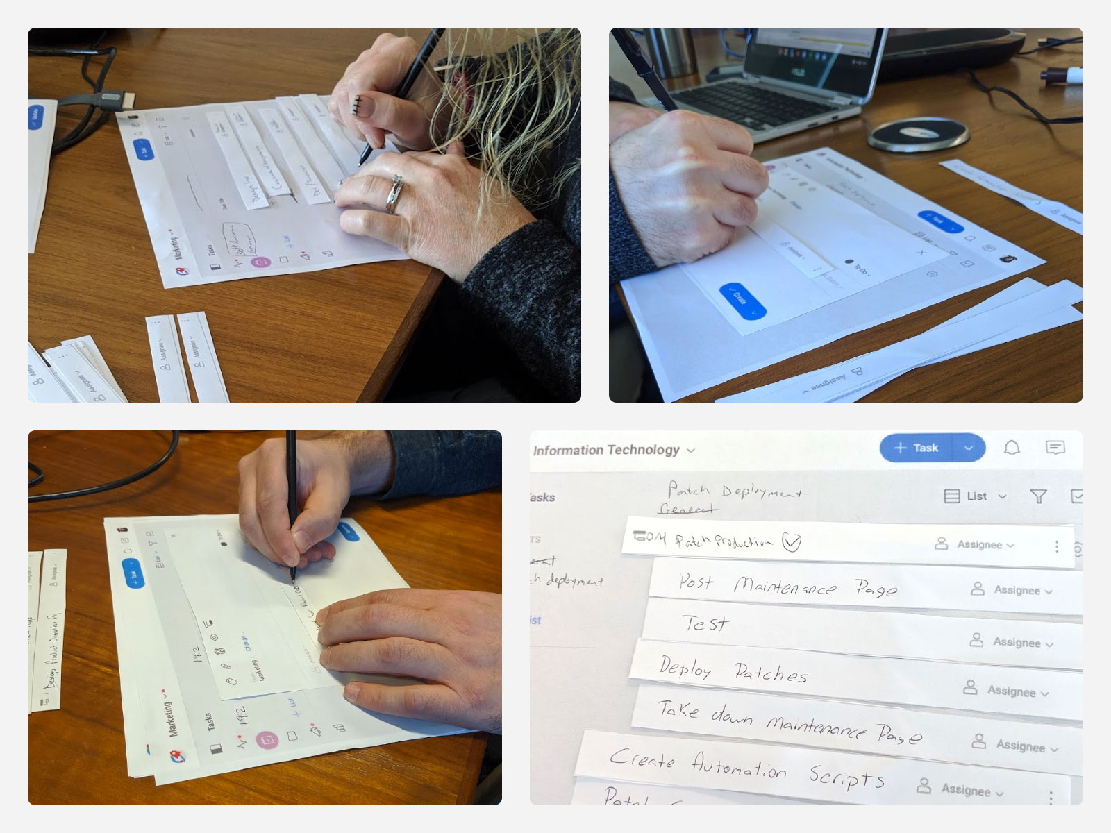
Paper prototype workshop that I conducted with users to understand more of their mental model in regards to creating and managing tasks
Through ongoing testing I learned which user tasks needed to be simplified. I also learned which data our user base preferred to see at a glance vs. what information they are okay with clicking into the task to view more data. As for the structure, users understood how to set up their tasks as the conceptual model that I designed met their mental model. The competitive research I conducted helped a lot in guiding me with designing the conceptual model. I also discovered that task creators would prefer to be able to input all task data during a 1-step creation process. My original design required the creator to create the task with minimal data (name / due date / assignee / description) and then forced them to open the task if they wanted to insert additional data. Feedback revealed this 2-step process would be a pain point.
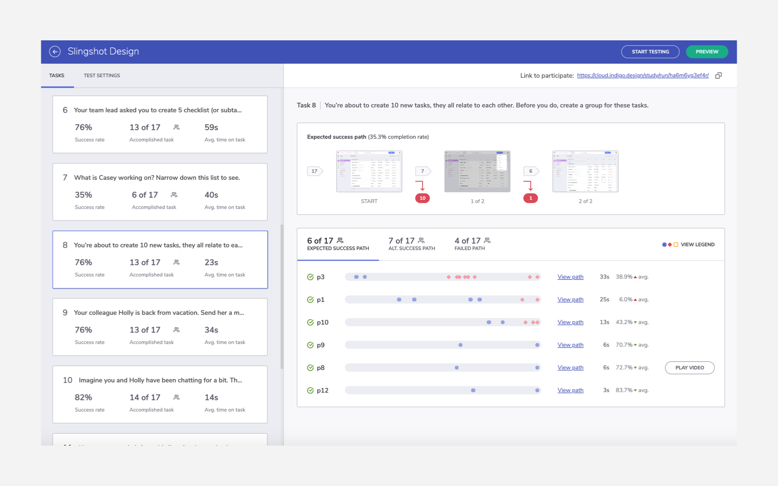
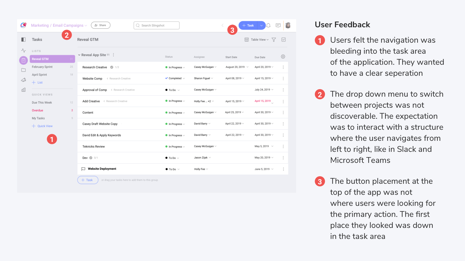
Portion of user feedback from usability testing which resulted in a redesign of the app navigation
How might we make projects more transparent so members are aware on who owns certain initiatives?
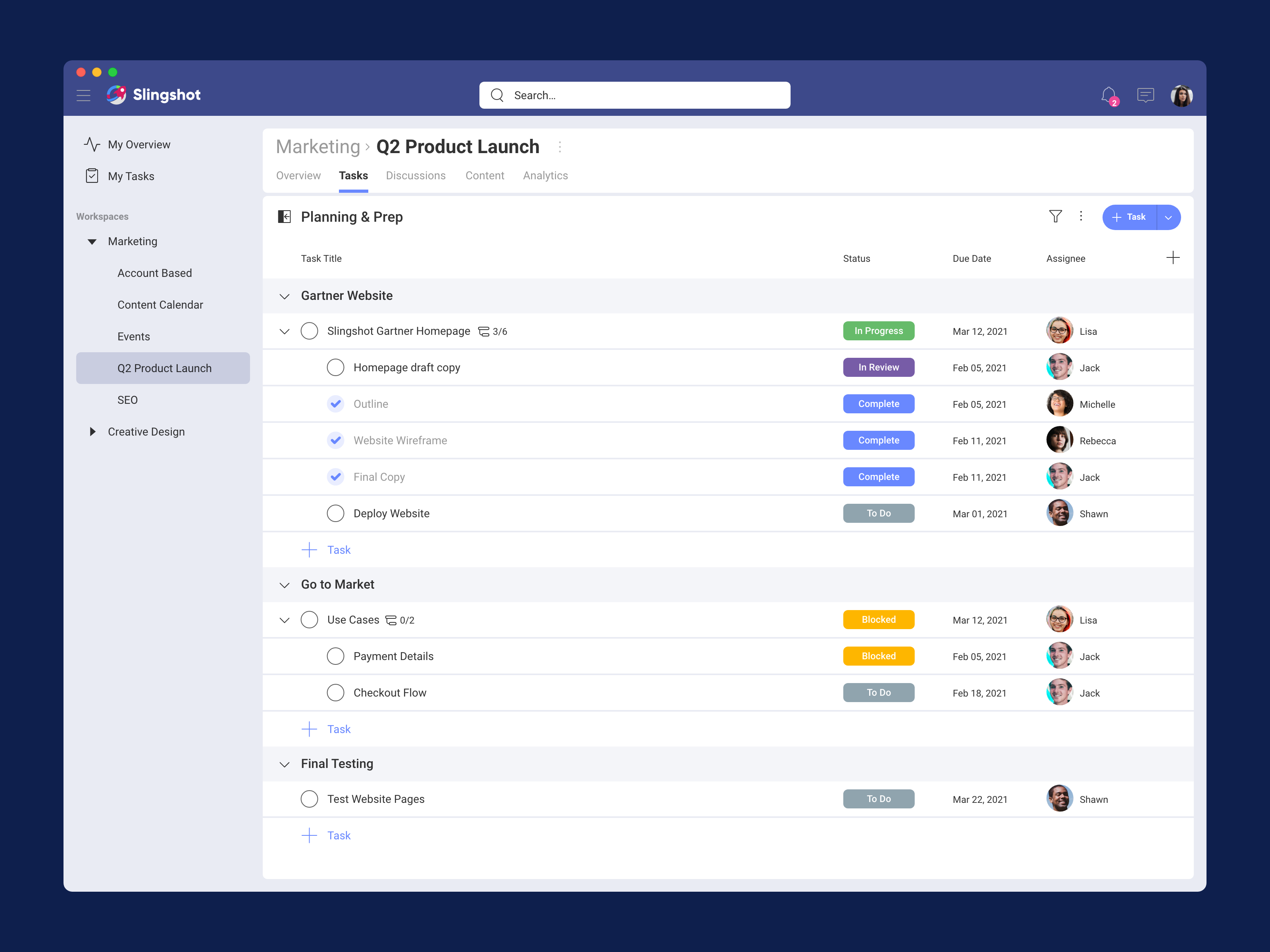
Managers can break down initiatives and have everyone aware of what their responsibilities are.

Column cells are interactive so users can quickly modify the metadata of a task
Using Timeline view, managers can set dependencies and get a view of how many tasks are overlapping each other.
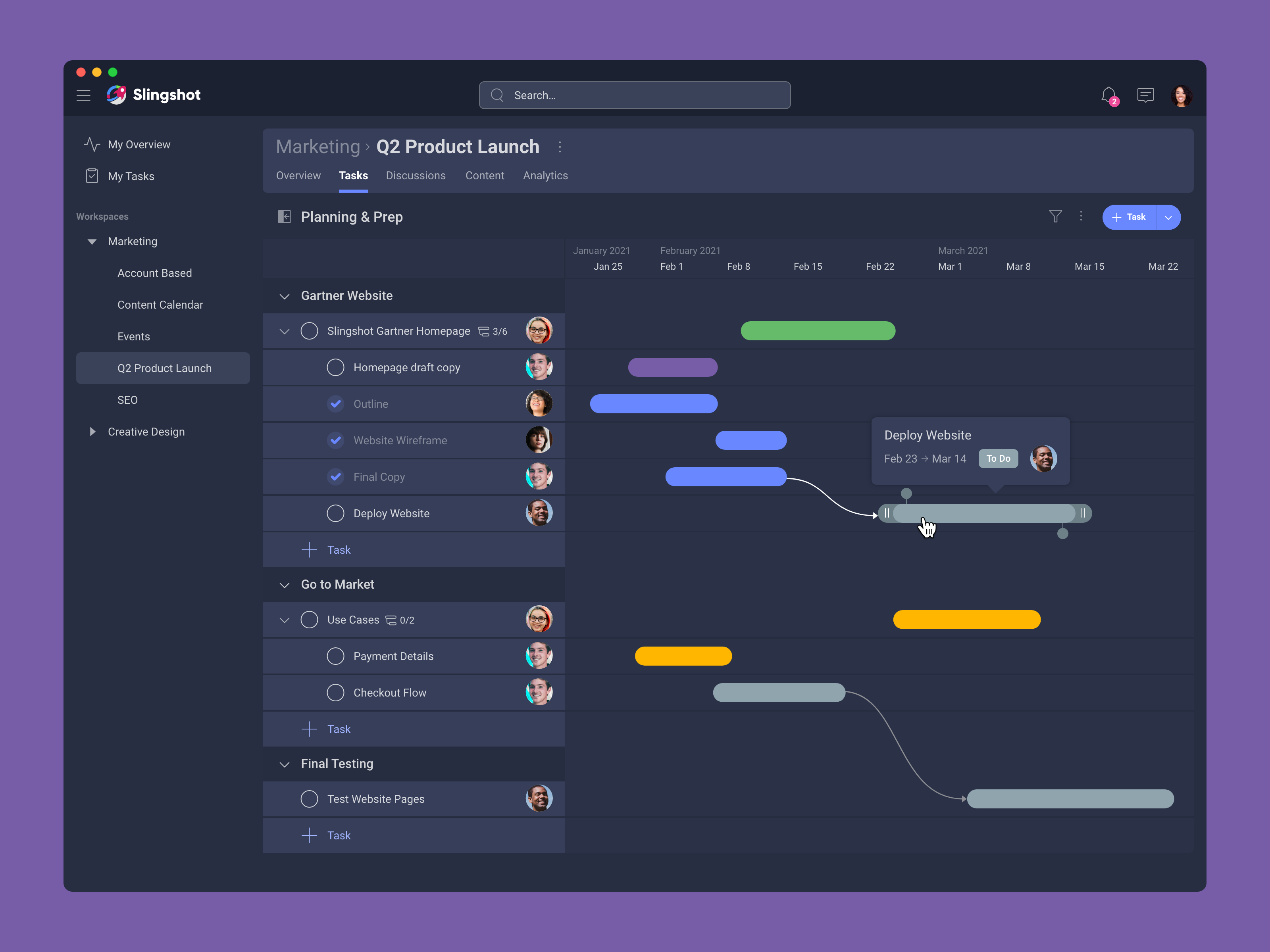
Hovering over tasks gives the user a preview of the metadata in a tooltip as well as the option to set task dependencies
Team members can access documents, post their updates, know when tasks are due and what needs to be done. They can communicate updates and issues with each other. Managers can learn of blockers so they can jump in to remove them.
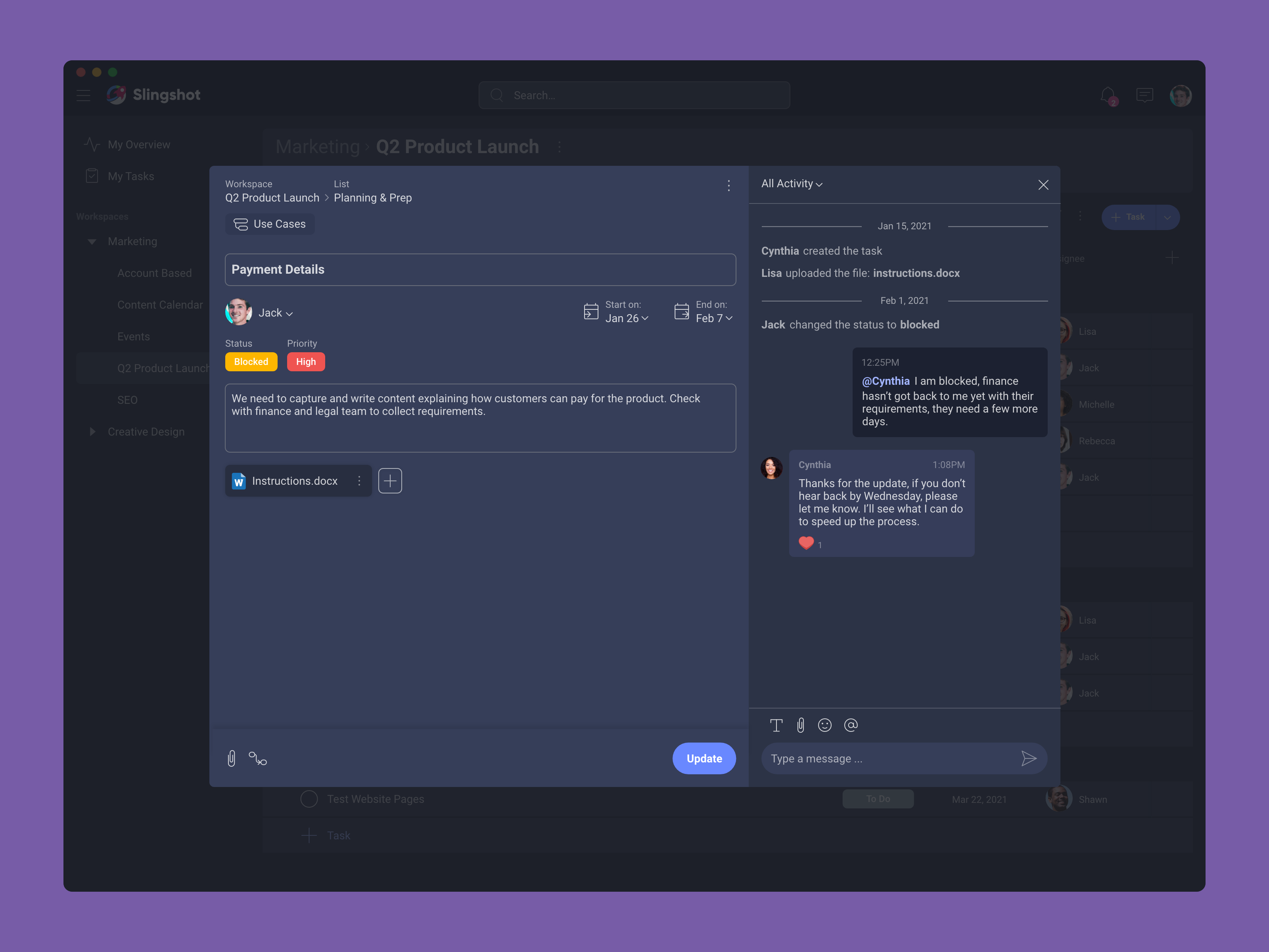
How might we eliminate the need to micromanage so management can worry less about status and focus more on removing roadblocks?
Visualizing project data allows managers to see at a glance who is blocked & see how the project is progressing without needing to constantly check in with direct reports

How might we remove friction in order to speed up workflows so users can see the benefits of using our product?
Integrating our features together allows customers to create within their current workflow.
Creating a task from a chat message
The mobile app is optimized for the user interacting with the interface using their thumb. The primary action is located at the bottom of the screen, and the app utilizes sheets for presenting users with menu options.
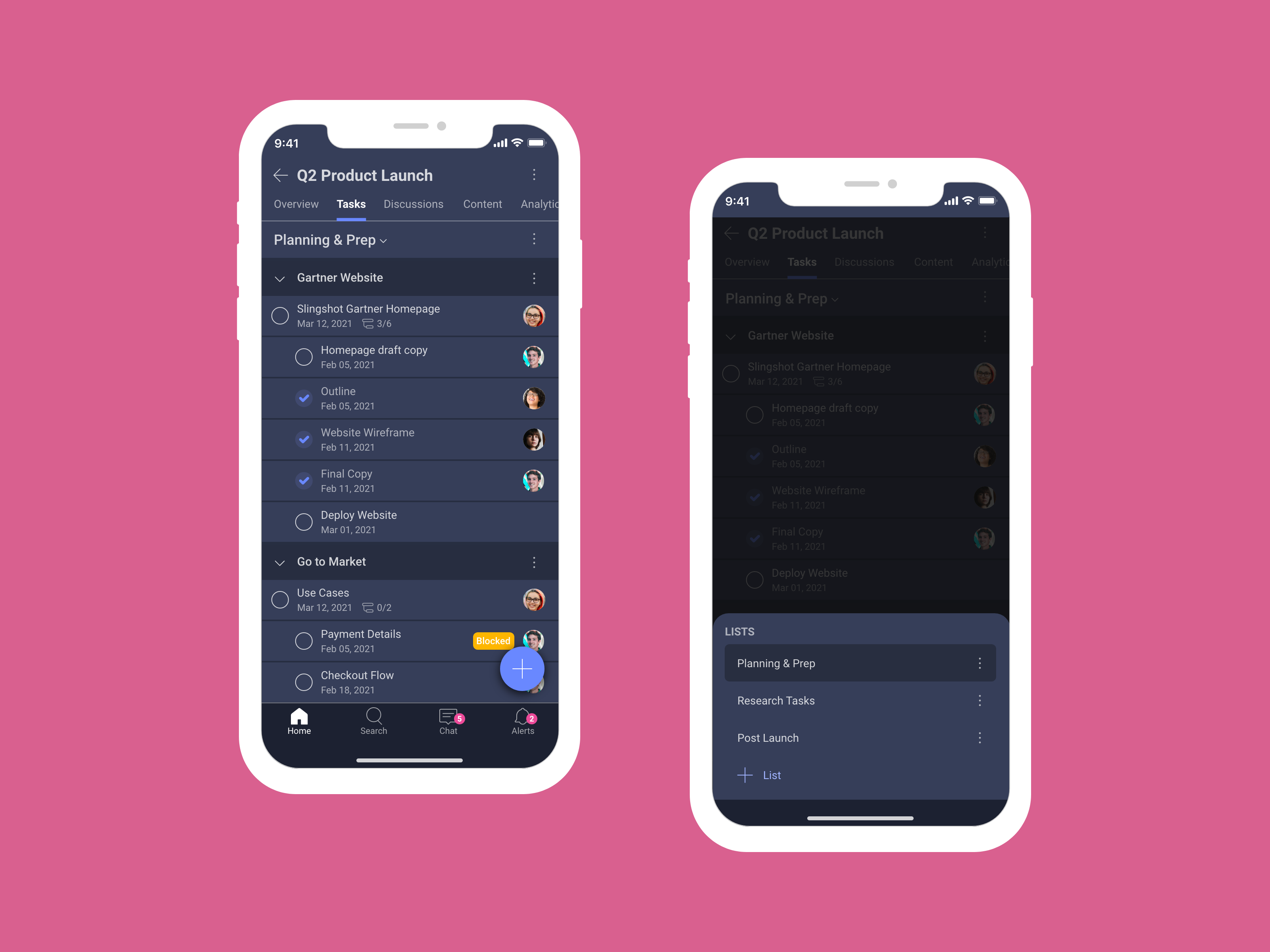
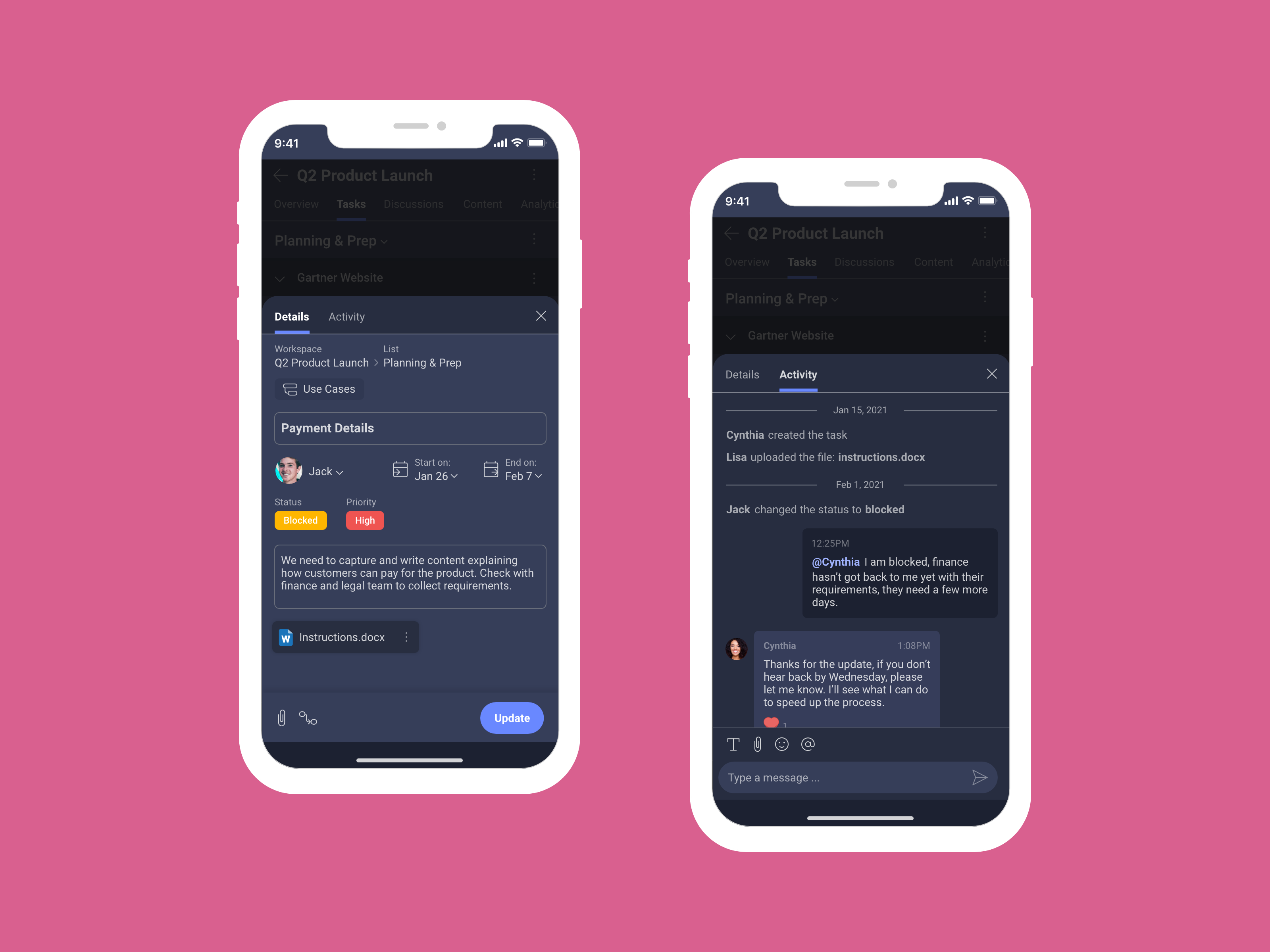
Working with a design system designer, we created a custom design system using the Atomic Design approach.
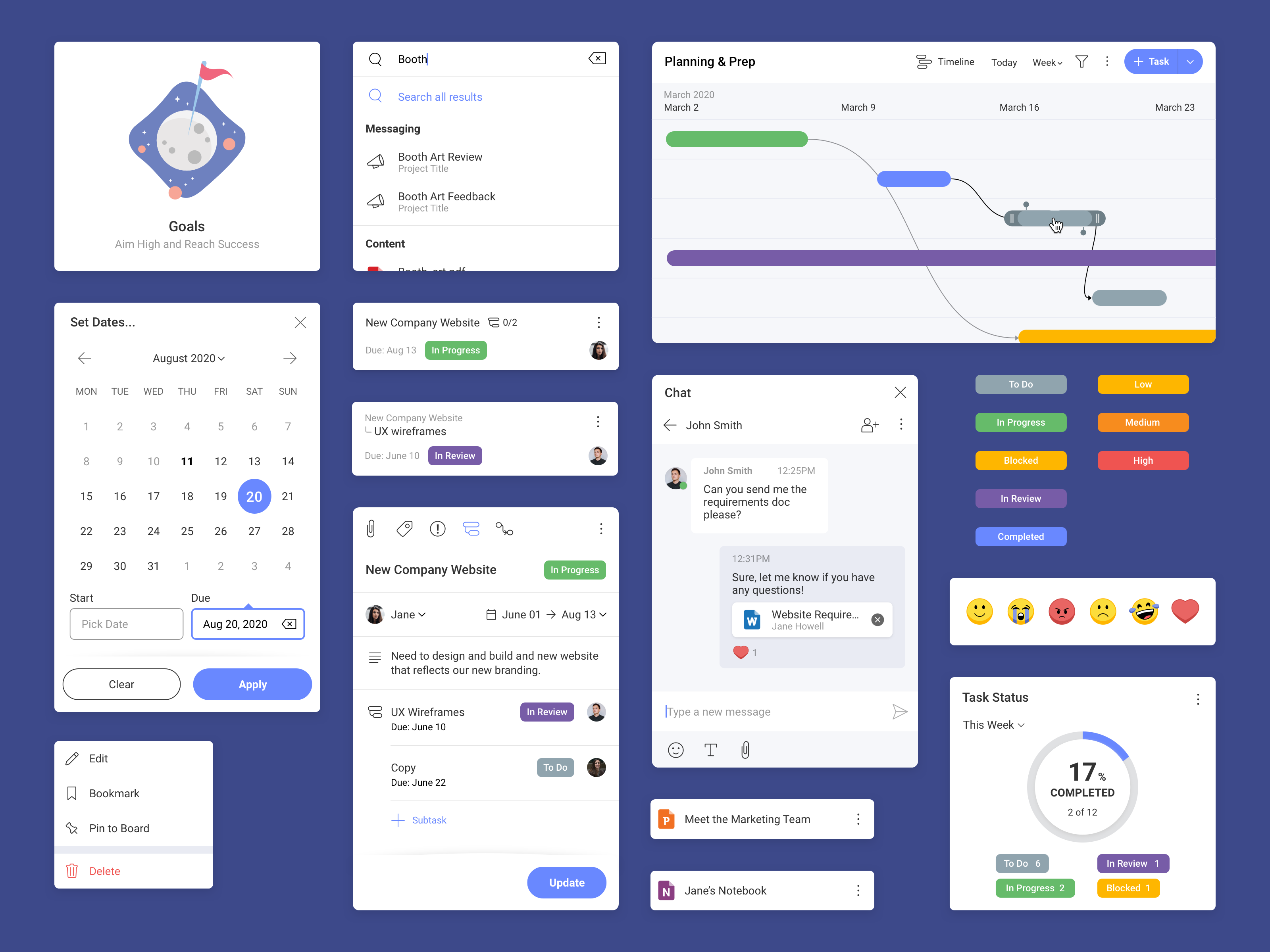
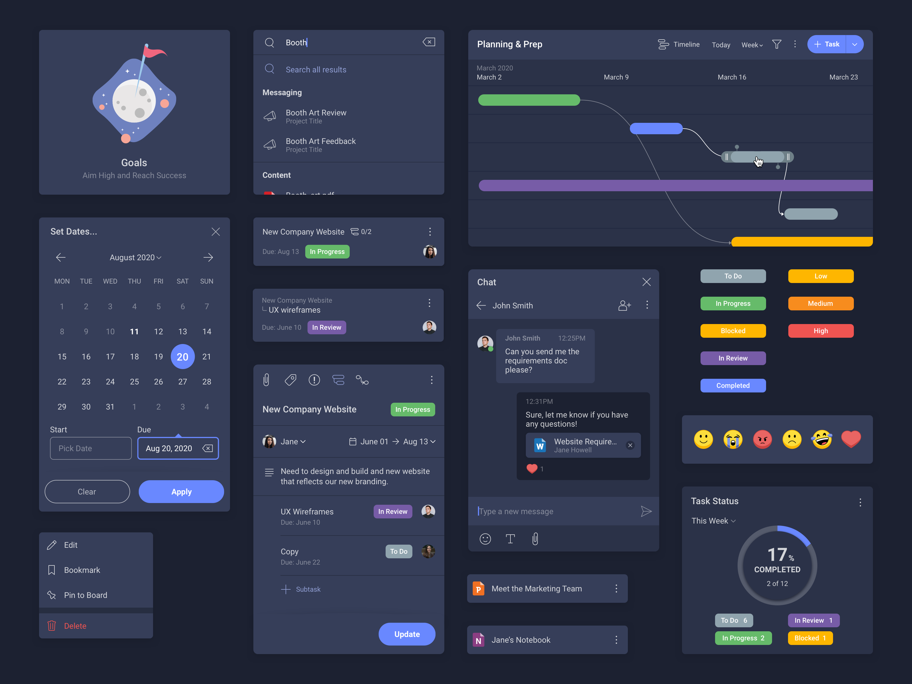
Custom components designed for light and dark theme
Enabled new customer segments
Opens up new revenue streams for the business
1,400 active users & growing
Organic growth with minimal marketing spend
Launched a research user group
Passionate users are joining our group to participate in usability tests and research sessions
“This answers a lot of my frustrations in my role at the moment, having one central place where everything is stored and accessed and you can manage workflow and capacity and resourcing, it’s what we‘ve trying to get to for a long time.”
“This platform is similar to Trello, but easier to use and more intuitive.”
“We have broken feedback loops in the team, we lose time because of our stuff being all over the place, so this tool helps us.”